On Sun, 26 Apr 2009 01:14:38 +0100, "Bertram Paul,
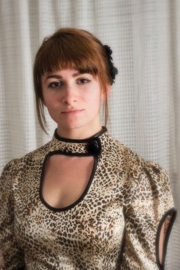
Post by Bertram Paul, Atlantic-Diesel.comLike I said: it isn't perfect. I didn't have a good background; the curtain
in the back is very narrow. Cutting her arm like that was the only option,
because otherwise I would have part of a blue curtain on the left. Besides,
it shows off her self designed dress better with the left sleeve.
The grey I don't see. I looked on two different computers, both calibrated.
It is kind of dark, because I like it that way.
Better next time.
I did read a lot of books and have quite a video collection from Ansel
Adams, Henri Cartier-Bresson (3) up to Annie Leibovitz. But I'm still
learning every day!
You have to keep in mind that you are posting in photography
newsgroups. When a photograph is critiqued, and that photograph is of
a family member, it's difficult not be defensive. Doubly, even,
because you are defending the family member and your own photographic
skills.
I, too, get an impression of grayness about the image. The gray cast
of the curtain behind the subject dominates the photograph. The dress
is rather playful looking with the faux leopard and it clashes with
the old-timey look of the curtain. You already know of the lighting
problem.
I'd take that photograph, knock-out all of the background, and
experiment with some different background colors in Layers. Not to
get a final image, but to learn what colors work with her hair and
skin tones to set her off. Something to learn for the next portrait.
The subject's skin is lovely, but it's mostly in shadow. It will hold
up under more lighting.
A personal comment about your daughter...she has more sense than many
of her years. She's applied make-up to enhance, and not to dominate.
Most young girls don't know when to stop.
--
Tony Cooper - Orlando, Florida
