Post by Bowserhttp://www.pbase.com/shootin/interesting
Why didn't you submit?
I thought, on the whole, this was quite a good showing.
The photographs of the equipment that Eric Stevens submitted are
excellent photographs, but not really interesting as subject matter.
The kite photograph, though, is quite clever. Here's where a snapshot
works as "interesting", but two very well done photograph don't.
Bob Coe gets two thumbs-up from me, but the bridge turned sidewise
fails to interest me. The two that work are impressive in the
presentation.
Martha Coe has submitted three excellent photographs, but not one of
them meets the "Interesting" mandate in my view. Good - more than
good - photography, but calendar art subject matter.
Bob Sosenko's image doesn't make it for me, but that's because I think
that this kind of post-processing is gimmickry. I wish I liked it;
Bob's obviously done a skillful job. It's just not my thing.
Bob Flint's contributions miss the mark. I don't know what I'm
supposed to see in any of the three that is interesting.
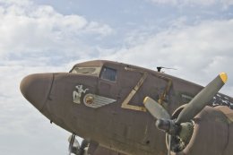
Savageduck's submissions seem to shout out "I love taking pictures of
airplanes!". The T-28 Trojan engine is the only one, though, that
comes across as interesting.
Tim Conway came in with a mixed bag. The airplane engine wouldn't be
a keeper for me, the three domes is an excellent photograph that -
like Martha's photos - is great calendar art but is not particularly
interesting. The dandelion is both laudable as something done well
and as an interesting shot.
Calvin Sambrook nailed it for "Interesting". Ordinary subject matter,
technically nothing to rave about, but a photograph that makes you
know the photographer was going for an interesting scene.
Solomon Peachy is probably my favorite photographer for the Shoot-Ins.
He always comes up with something that makes me think "I wish I would
have done something like this".
Bowser should have held back the dog statues, but the woman and the
dog on the scooter is my hands-down favorite for this month. *That*
is an interesting shot! The other thing...I dunno. I suppose it's
interesting in a way.
Simon's shots are OK close-ups, but fail to be interesting.
Frank-ess, however, has a bug shot that *is* interesting. It's not
just sticking a lens in front of a bug. Frank needs to buy a blower
and clean the dust off his sensor, though...three noticeable dust
bunnies. The fence and flower shot could be much better if cropped
right. Images don't need to be rectangles in standard ratios. Crop
this one right along the grass line and in on both sides. The
artist's lair looks a bit too artificial. Everything looks placed for
effect.
Lunabella's flamingos are almost neck-and-neck with Bowser's
dog/woman/scoot for my favorite of the month. Really interesting.
Two suggestions...clone that white thing out at the lower right, and
put a thin, white border on your dark Shoot-In submissions. With the
PBase black background, the dark photos bleed out visually.
Helen's Miss Victoria certainly qualifies as interesting. I'm a bit
put off by the self-deprecating comments (not my best work) and all
the post-SI hoohaa, but the mandate was "Interesting" and that's what
Helen produced.
I found Alan Browne's photographs to be interesting. Alan is
technically very strong on interiors and sharp images. The two inside
shots miss the "calendar art" designation because they have an
interesting factor in the black lines. Unlike others that have posted
on these shots, I felt the text descriptions were both necessary and
interesting. Without the text, the lines didn't make sense. The
outdoor shot is kinda painful. I look at and know that Alan cropped
to get that shadow diagonal in the lower right and lined up the shot
to get the stripe above the column point, but didn't come up with a
good photograph. It's murky and has distractions.
Paul Furman certainly came up with interesting subject matter, but the
photographs are not pleasing to the eye. The theme was "Interesting",
but the shots still have to be good photographs.
Perhaps Bret has a point in that "Interesting", as a mandate, was too
vague. Several people submitted very good photographs, but they were
not really photographs of interesting things or ordinary things
presented in an interesting way. Eric's kite, Bob Coe's
presentation, Tim's way of photographing the dandelion, and some other
as mentioned above came across as interesting to me. I felt my own
shot of the very realistic-looking manikin was interesting. Some of
the others, even though they were good as photographs, didn't come
across as interesting.
--
Tony Cooper - Orlando, Florida


